sh
me

Client: Hayat
Task: Visual Identity.
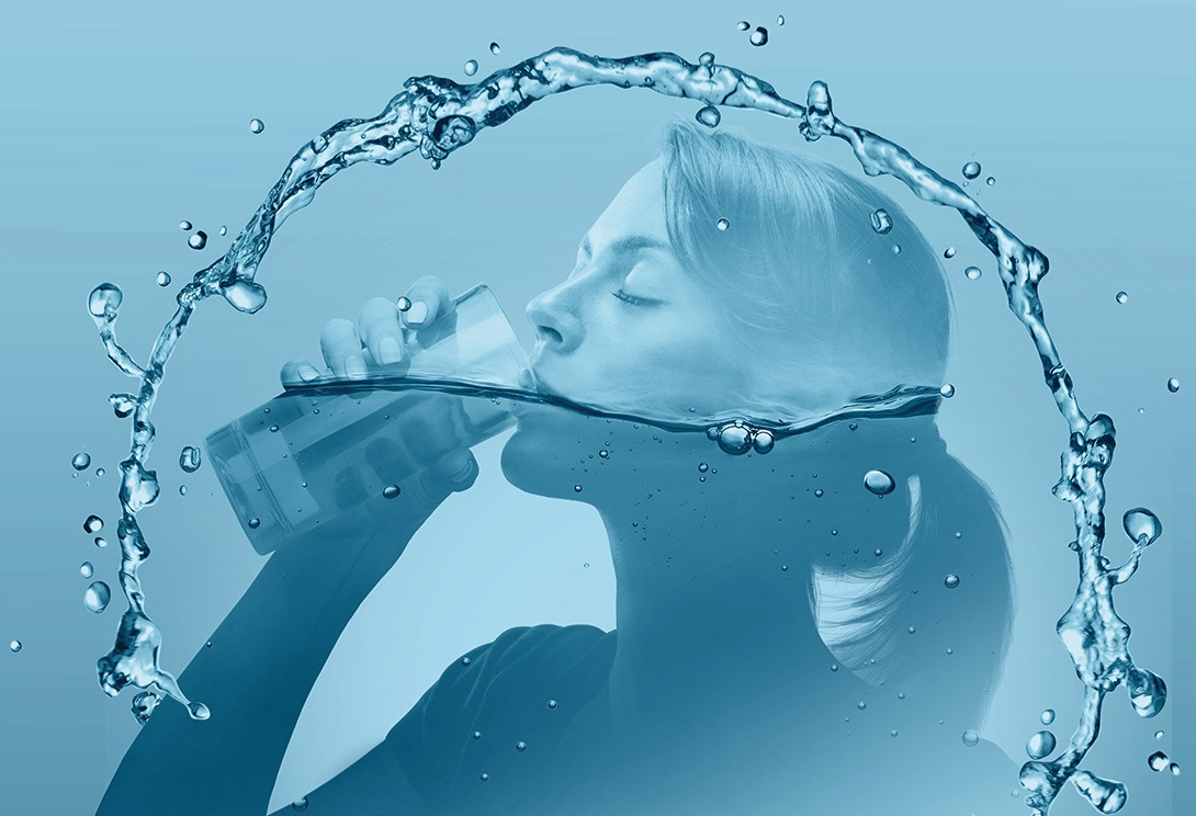
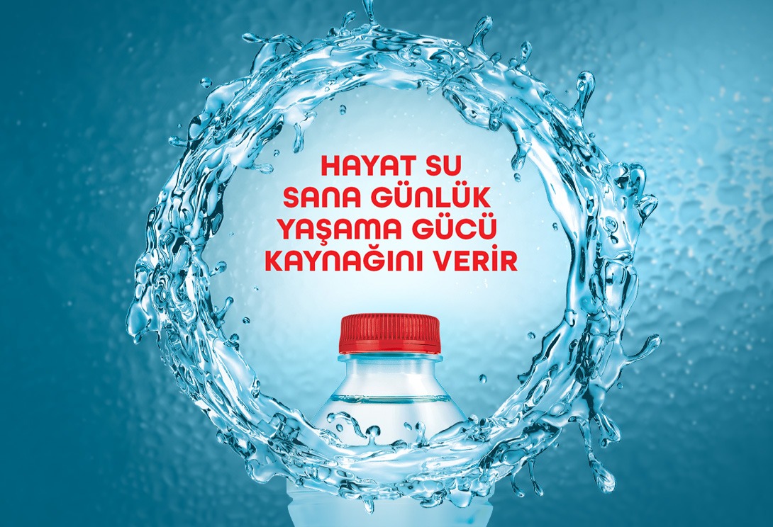
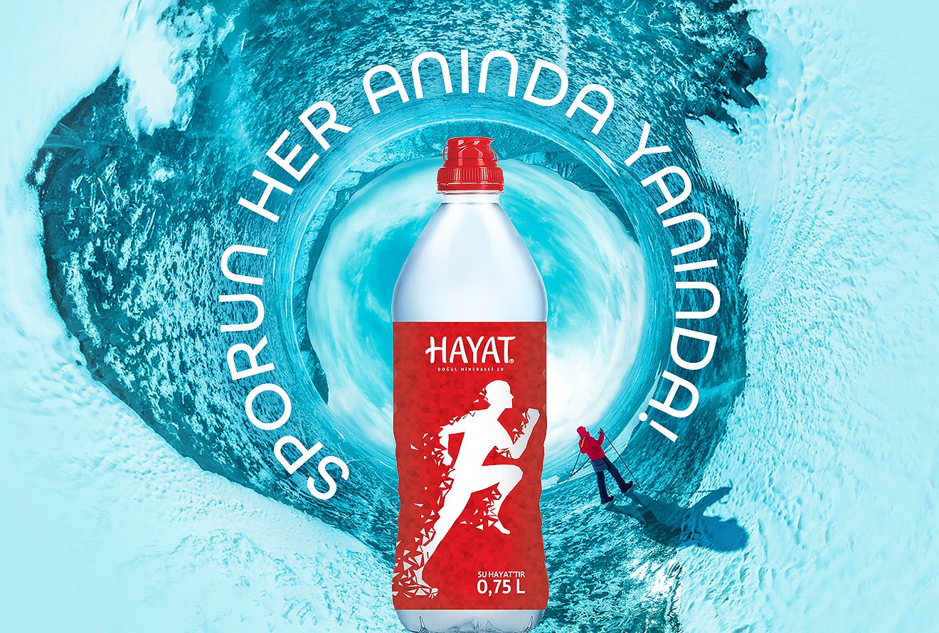
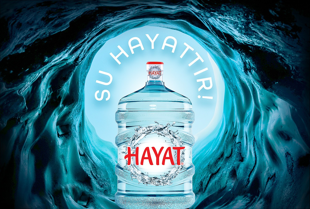
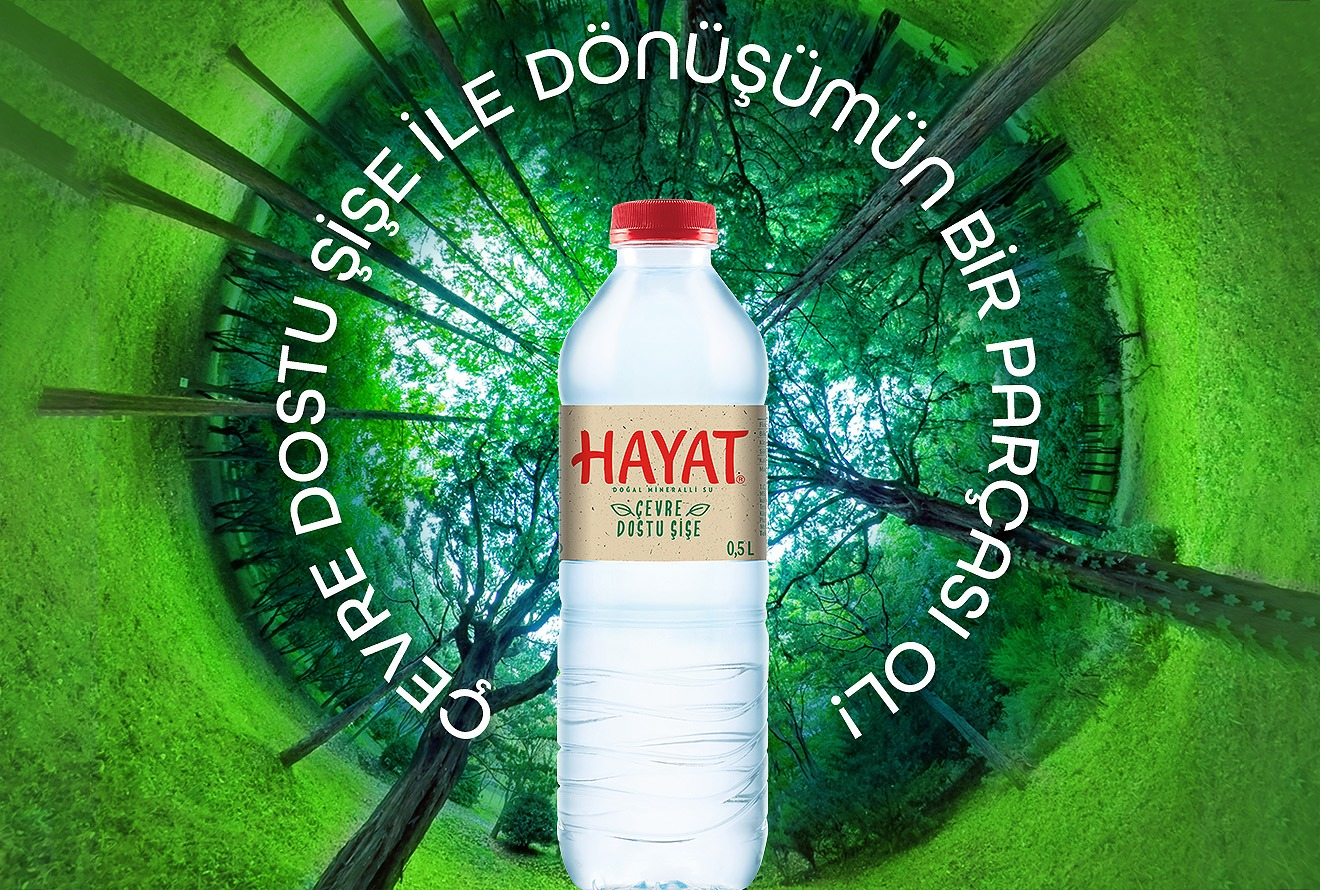
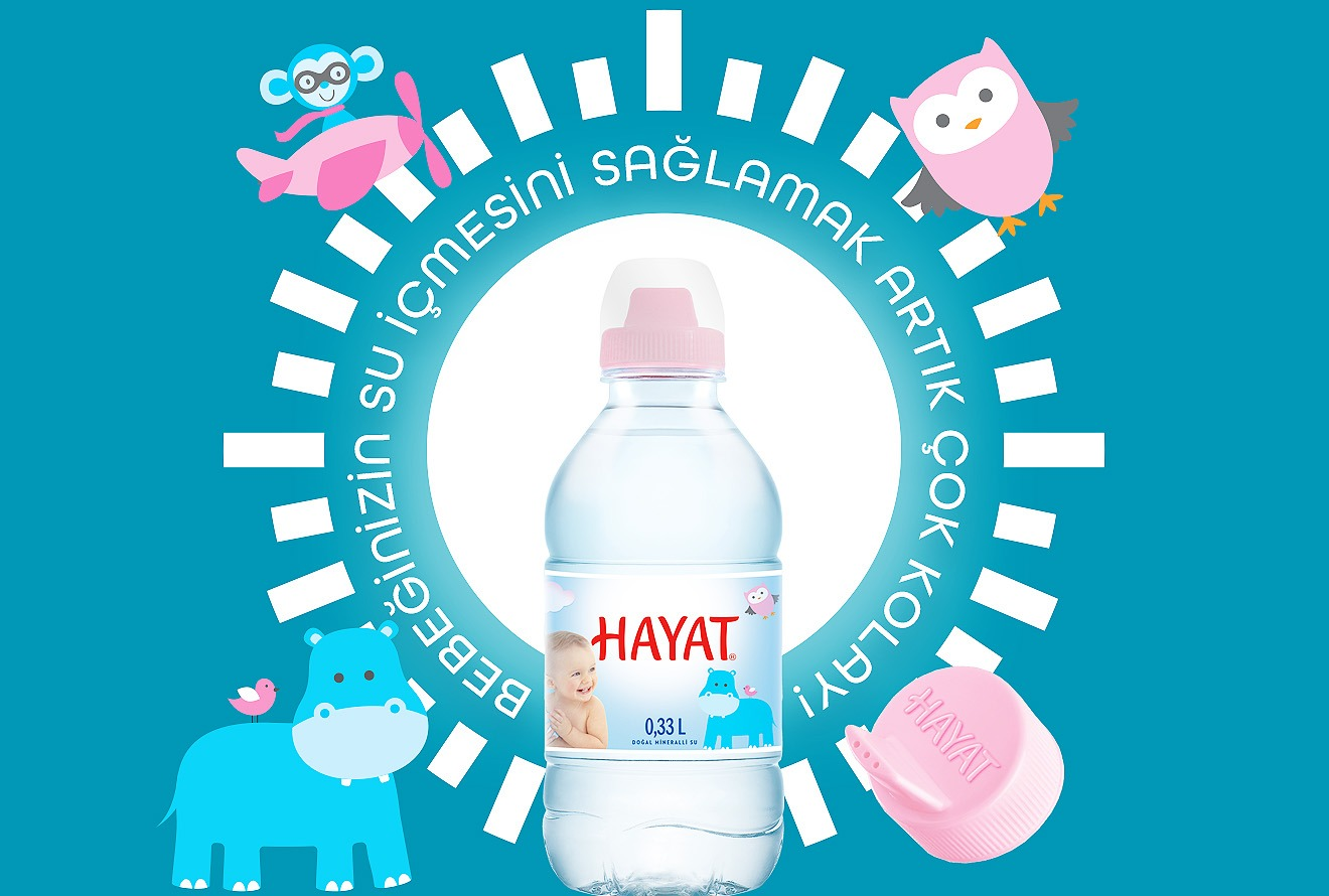
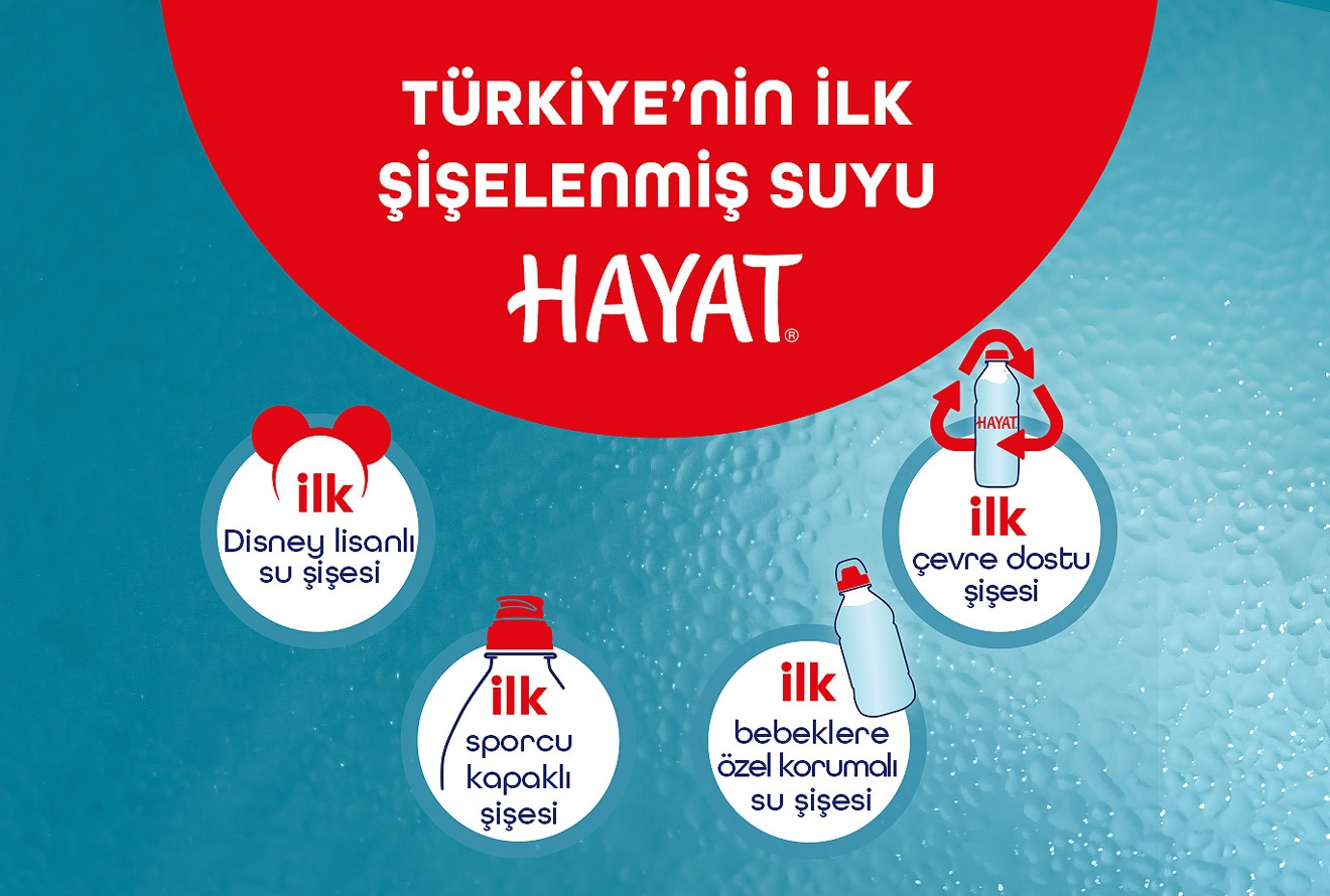
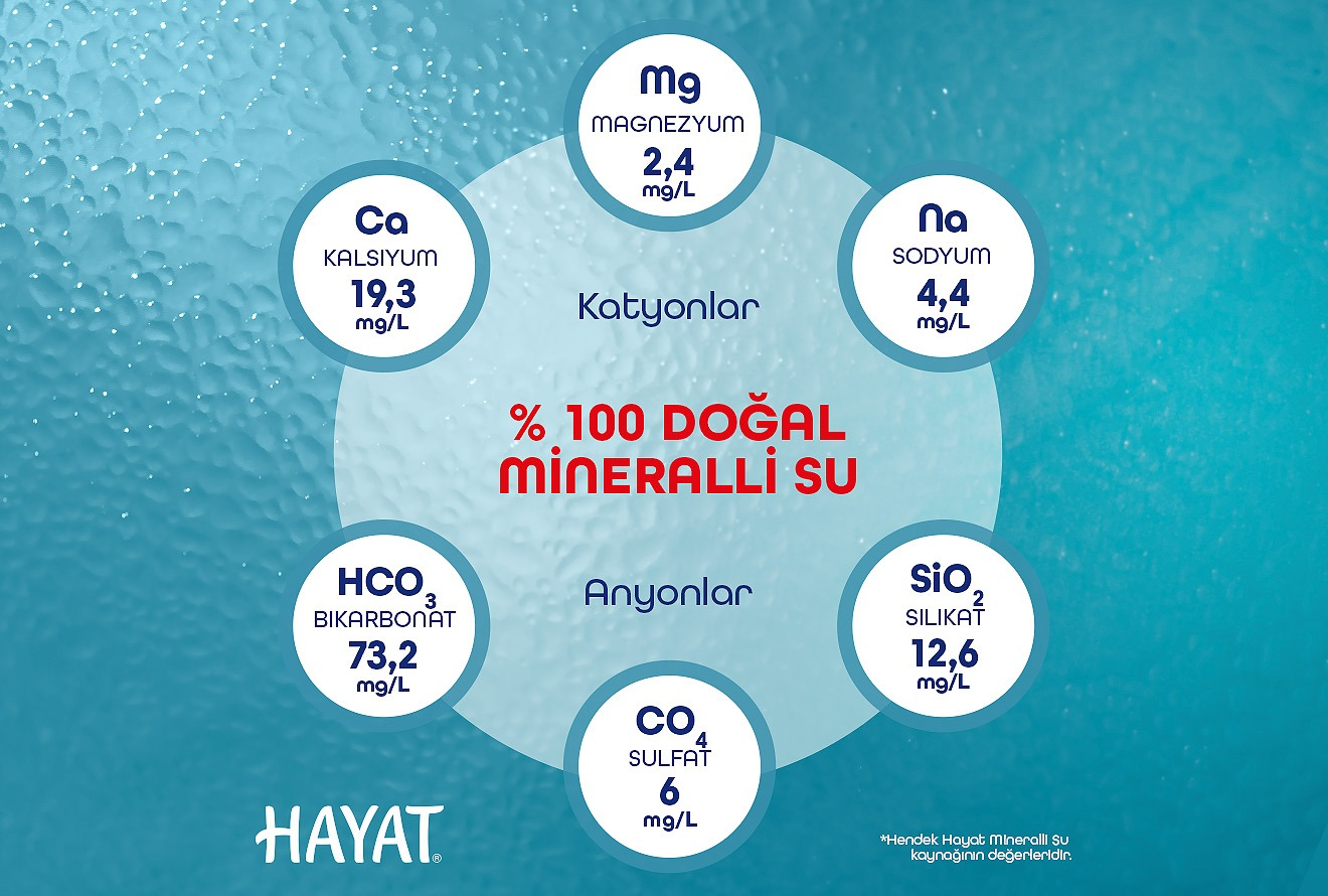
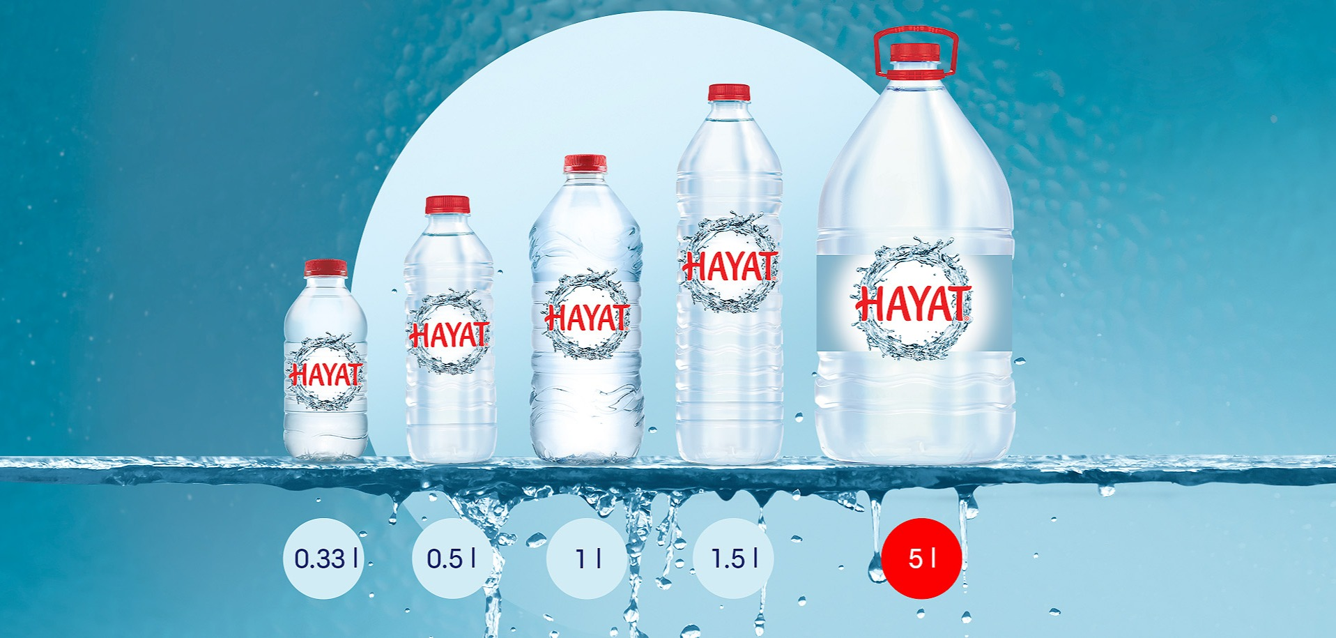
The agency objective was to reflect the nature essence and the philosophy of vitality of Hayat Su mineral water in a visual identity designed for e-commerce platforms. The visual elements needed to mirror the brand style and character while distinguishing it from competitors with similar positioning. For all product lines, we developed unique key visuals featuring group packaging, product, and brand claims, key water composition highlights, and the entire product family.
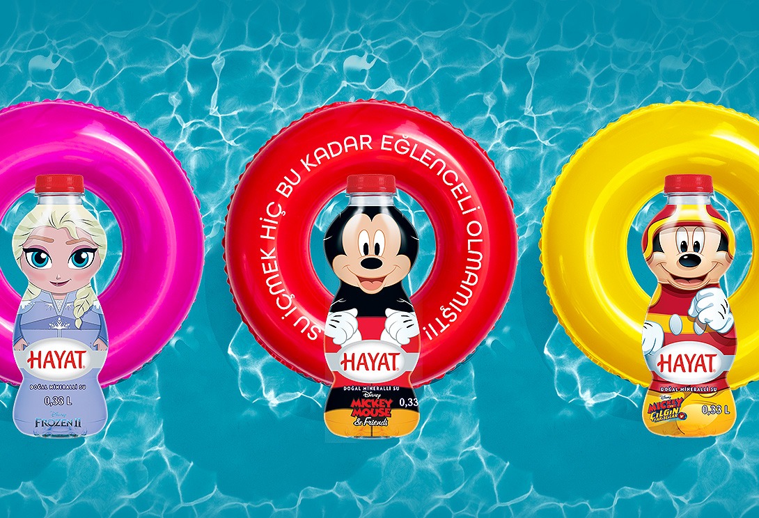
The e-commerce toolkit key visuals encapsulate a vibrant red, a bold and distinctive brand color uncommon in the market, and ice blue. The brand existing logo, symbolizing the life cycle, was developed into a key visual element. Building on this foundation, we introduced additional circular elements, which became the centerpiece of the visual communication across all SKU lines. Using photographs featuring smiling individuals in various life scenarios effectively conveys the brand positioning, core messages, and values.