sh
me


Client: Natur+
Trade mark: Hematogen
Task: positioning, rebranding, packaging design, key visual


After market research, our team repositioned the Hematogen brand strategy and suggested moving from Soviet nostalgia to taking care of yourself and loved ones. We chose a tree as a key element of identity, symbolizing life and the circulatory system.

The new packaging design stayed recognizable to the existing brand audience, but started to follow the market trends. We simplified the design by removing the additive image, and changed the colorful two-tone solution to a refreshing mint one. The colors of the balls became colder and deeper.

We used color coding of the taste identifier to differentiate the SKUs and chose a horizontal position and a dense, low-contrast font to make the text more readable.
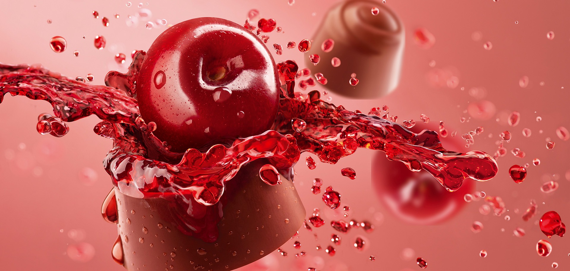
For key visuals we put the product against a background that echoes the color plate on the package. Also we use minimalist food accents to enhance taste perception and convey the products’ features.
